Quote:
Originally Posted by Lanfear

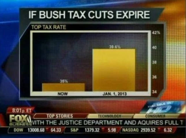
They picked a visualization that makes their point look good and you picked this one vs a boring bar graph that would show a realistic difference.
Not that you can't make bar graphs fucked up
 |
Apples and oranges. Not even fuckin oranges. You're comparing apples and Trump steaks for fucks sake.