On Air right now
Listen to Keith and The Girl record a live show
free comedy talk show
Keith Malley and Chemda
Keith and The Girl Free Comedy Talk Show


 31Likes
|
Keith and The Girl is a free comedy talk show and podcast
Check out the recent shows
Click here to get Keith and The Girl free on iTunes.
Click here to get the podcast RSS feed. Click here to watch all the videos on our YouTube channel. |
|
 04-01-2016, 11:07 AM
|
#11 (permalink) |
|
Senior Member

Join Date: Apr 2008
Location: Georgia
Posts: 5,397
|
the division of that moose is not in proportion to the the difference between the delegate counts. it looks as though Bernie has a /significant/ overage to Obama and that doesn't feel like the case here.
i'm saying this graph is bullshit. |
| (Offline) |

|
|
04-01-2016, 11:20 AM
|
#12 (permalink) |
|
Senior Member

Join Date: Dec 2013
Location: Ft. Lauderdale, FL
Posts: 448
|
The division of the colors of the moose aren't to show percentage. That's just the democratic party symbol. The numbers are real. Go look them up. Were you paying attention in 2008? Because Obama was considered as unlikely as they are trying to paint Sanders now.
|
| (Offline) |
|
|
Keith and The Girl is a free comedy talk show and podcast
Check out the recent shows
Click here to get Keith and The Girl free on iTunes.
Click here to get the podcast RSS feed. Click here to watch all the videos on our YouTube channel. |
|
|
04-01-2016, 11:33 AM
|
#15 (permalink) | |
|
Senior Member

Join Date: Sep 2006
Location: Frankfurt am Main, Germany
Posts: 2,577
|
Quote:
I work in market research, this is typical shady Fox News level misleading graphs 101 |
|
| (Offline) |
|

|
04-01-2016, 11:39 AM
|
#16 (permalink) |
|
Senior Member
Join Date: Dec 2013
Location: Ft. Lauderdale, FL
Posts: 448
|
yea im sure whoever created the image was totally banking on people not reading it at all and only looking at the allocation of color representation on the donkey. Give me a fuckin break weirdos.
|
| (Offline) |
|
|
04-01-2016, 11:45 AM
|
#18 (permalink) | |
|
Member

Join Date: Mar 2007
Location: South Dakota
Posts: 32
|
Trump Hurmp
Quote:

|
|
| (Offline) |
|
|
04-01-2016, 11:46 AM
|
#19 (permalink) |
|
Senior Member
Join Date: Sep 2006
Location: Frankfurt am Main, Germany
Posts: 2,577
|
They picked a visualization that makes their point look good and you picked this one vs a boring bar graph that would show a realistic difference.
Not that you can't make bar graphs fucked up 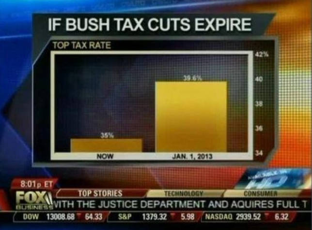
|
| (Offline) |
|
 |
«
Previous Thread
|
Next Thread
»
| Currently Active Users Viewing This Thread: 1 (0 members and 1 guests) | |
 Linear Mode

|
|

All times are GMT -5. The time now is 02:31 AM.